The Art of Becoming a Linchpin Amid Lizard Brains

51rQvBU6YGL._SS500_Take Sir Ken Robinson’s Changing Education Paradigms, mix it with self-help and progressive marketing for today’s connected world. Now roll it out in an ‘Art of War’ like style and you’ll come close to Seth Godin‘s Linchpin – Are You Indispensable.

This book is a DIY manual for thriving as an entrepreneur or employee by becoming an indispensable linchpin, who creates their own success, often without a fancy title. At a high level, Godin describes linchpins as: “people who invent, lead (regardless of title), connect others, make things happen, and create order out of chaos.”

Their contributions go beyond working hard or achieving ‘measurable’ excellence with a set limit. A linchpin exerts emotional labour, which Godin describes as the few minutes of brilliance they deliver unique interactions of exceptional value.  As an example, he cites the emotional labour Richard Branson exerts to: see new opportunities, make decisions that work, and understanding the connection between his audience, his brand and his ventures.

In this book, Godin outlines what it takes to be a linchpin with many examples, where they fit in today’s world, why there aren’t more linchpins and how to become one.

Beware Education and the Lizard Brain

Godin describes our transition from industrial jobs, where we were cogs in a system, to today’s new economy where linchpins are the building blocks of great organizations. He outlines obstacles that hold many potential linchpins back. In doing so, he touches on some of the points cited by Robinson in his lecture on the challenges with our rote learning education system. This system rewards traits like fitting in, waiting for instructions, avoiding risks and discourages creativity.

This education sets the stage for the resistance or what Godin coins ‘the Lizard Brain.’ This villain is the part of our mind with our primitive, survival instincts that erode confidence and seek the easy route. According to Godin, the Lizard Brain’s foil is the Daemon, which is the part of our mind that is the source of great ideas, groundbreaking insights, generosity, love, connection and kindness. The Daemon encourages us to “ship” — that is complete a project in at least its first iteration. Godin sees shipping as key step in the long-term path to becoming indispensable, and as an action that’s threatened by the Lizard Brain.

Rise of the Linchpin

Controlling the Lizard Brain, along with giving to others, being an artist and leading without a set map, are some of the steps Godin explains for becoming a linchpin. And when it all comes together, a linchpin can emerge and be noted for:

  1. Providing a unique interface between members of an organization
  2. Delivering unique creativity
  3. Managing a situation or organization of great complexity
  4. Leading customers
  5. Inspiring staff
  6. Providing deep domain knowledge
  7. Possessing a unique talent

The book itself includes many inspiring stories of real linchpins, thought-provoking quotes and ideas. I found the descriptions of the seven linchpin attributes and their examples offered practical ideas. I also liked how Godin’s ‘need to ship’ virtue ties in with agile methodology. Unfortunately, I found sections of the book wordy, repetitive, disjointed and more detailed than needed to convey the core messages. It’s too bad Godin didn’t “ship”  an abbreviated version, so we’d have more time to retool and become shiny linchpins.

Torn Between Squarespace and WordPress Website Builders

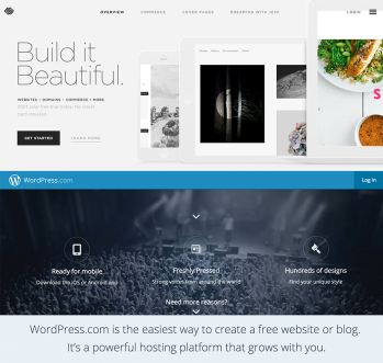
Squarespace versus WordPress homepages.

Today, few business can run without a website. It’s your ‘physical’ reception to the world and your interactive welcoming party. Web savvy start-up entrepreneurs, particularly those with low tech firms, can use one of many DIY tools to build and manage their own sites. The challenge is which site builder do you use?

For some time, WordPress has been my ‘go to’ tool. One of my key reasons is because more than 23 per cent of the web’s sites use it and it seems the ‘de facto standard.’ Having seen many great technologies ‘eaten’ by dominant players (e.g. Beta vs VHS), I’m leery about deviating from this route. WordPress offers two main options: wordpress.com, which includes hosting and wordpress.org, which requires you to pay another supplier for hosting. I’ve used both and found them economical, easy to use and maintain.

That said, newer site builder Squarespace is tempting. Like WordPress, Squarespace is cost-effective, has an user-centric Content Management System (CMS) and offers responsive templates.  Squarespace also has several templates with up-to-the-minute design features and all its pricing options offer e-commerce. Although you can do online financial transactions on WordPress.com, its flexibility is limited since you must run them via one of its partners, such as EcwidShopify or Gumroad.  

Digging further to check online sources, here is how I find Squarespace and WordPress stack up against each other in five key areas:

  1. Content Management System (CMS) – Some reviews cite WordPress as easier to maintain than Squarespace but harder to set-up, particularly its WordPress.org version. For either WordPress option, it takes a few minutes to learn the terminology, such as the difference between pages and posts. Once setup, WordPress’ CMS interface is fairly intuitive and functions much like MS Word. You can also easily edit the HTML in WordPress. The jury is out on whether Squarespace is easier to learn and use or not. Some critics, such as Elegant Themes rate Squarespace’s page editor as more complicated to view and more work to use since you must use secondary windows to edit some elements. Other reviews, like one on wpbeginner, suggest Squarespace’s drag-and-drop functionality make it easier to use.  
  2. Cost –Wordpress.com offers packages from $0 to $389 but you can create an effective site with a mix of à la carte options. For example, you can pay $24 per year to set up a custom URL that makes it easier to find. To give it a more professional look, you can pay $39 to omit ads, which seem to show up when the site is viewed on a network with many users.  For wordpress.org sites, you can find external hosting for $3.95 per month (including domain name) through firms like  Bluehost or SiteGround. In contrast, all Squarespace sites include hosting and cost $96 annually for a personal site (which limits you to selling one product via up to 20 pages) or $192 for a business site (which enables you to sell up to 20 products via unlimited pages).
  3. Customization and Flexibility – Although wordpress.com offers the upfront flexibility of more than 360 templates, one of its disadvantages is you can only make limited customizations, without incurring extra charges. In contrast, Squarespace only has 20 templates but you can edit its fonts, colours and CSS, even at the Personal site level. But this pales when compared to the  more robust WordPress.org solution, which offers more than 27,000 templates and 29,000 plug-in features, enabling you to create unique sites for specific needs.
  4. Data Space and Image Handling – One review suggests early Squarespace versions limited site package users to 2 GB of space and wordpress.com offered up to 3 GB of space for free. However, Squarespace now offers the unlimited space advantage to all its users, while WordPress caps its free version at 3 GB (with the option to buy more). Squarespace also offers media perks, such as Getty image use at $10/image and more integrated image editing options than WordPress.
  5. Support – Most of the articles I read praise Squarespace for its support and lament Wordpress support.  In reality, WordPress has always sent me useful answers to any of my questions within 24 hours.

Squarespace’s flexibility and image features are ‘nice to have.’ However, I still think WordPress.com is the safer option because it offers numerous templates, as well as customization and e-commerce for a moderate price.  Plus, if your business grows and you need to scale up, Elegant Themes suggests you can and boasts WordPress’ strength for the long-term.

On-boarding to an Interactive-Focused Career

My interactive destination

I aspire to work in the healthcare sector or with Health 2.0 solutions to improve patient outcomes. However, I’m also open to opportunities in other sectors or a digital agency, particularly if I can create altruistic value, as well as revenue. My key goal is to work for a progressive but ethical organization that promotes a strategic approach to innovation, with a user-centred focus.

I want to be a digital strategist who conceives end-to-end interactive strategies that meet users’ needs and engages them to meet specific goals across web, mobile, social platforms and possibly more as the IOT evolves. To become proficient at this, I want to first hone effective skills for defining the narrative and content that guides users through these strategies. More than anything I want to work with teams that support a best practice approach to user-centred design and value interactive narratives with diverse elements, from sliders to games.

What I can bring on-board

During the past eight months, I’ve discovered new disciplines, such as UX design, interactive strategy and narrative, video production and learned new skills, such as wireframing, prototyping, usability testing and video editing, with a range of tools. I’ve also acquired new best practices to build on my content strategy, project management, analytics, social media marketing, business, Photoshop and HTML/CSS mark-up skills. In some cases,  I’ve also learned valuable lessons on how to position existing skills, such as user path development and content audits, that I didn’t recognize as marketable.

I can also offer transferable skills from earlier careers, such as strategic planning, presentation development/delivery, copywriting, marketing, financial literacy, strategic communications, technical writing and diverse software skills.

I think my interactive strengths lie in: end-to-end interactive narrative and content strategy development; social media marketing; and possibly analytics. I think I’m particularly good at deciphering needs, identifying gaps or opportunities and explaining/presenting concepts. I also have a strong grasp of UX design, usability testing, wireframing and graphic design. And when needed, I can use basic HTML/CSS skills or troubleshoot software to create a quick fix or workaround.

On-boarding for the first sail in the field

I want to attain a field placement in small agency or private organization with a strong digital focus. I think a small organization will give me a better grasp of how digital divisions work together and might offer more hands-on opportunities at varied tasks. At this point, I’m pursuing a placement at a diverse, entertainment start-up with an innovative team.

My top learning priorities for my placement are to take part in: user needs identification (possibly personas and user paths); strategy sessions; narrative and interactive content development; analytics and maybe even wireframing. It would also be wonderful to participate in script writing or video production but these are passions versus priorities.

I understand my potential field placement organization needs help with a crowd-funding campaign, supported by social media. Although I’ve never crowdfunded, I have run social campaigns and would be happy to help with these fundraising tactics, as long as I don’t forfeit my top priorities.

At the end, I hope to discover some new digital best practices or cautions, a clearer understanding of my value proposition to the interactive field and a real world addition or two for my portfolio. I think my biggest challenges will be keeping my focus on interactive digital tasks and trying not to achieve mammoth results in 315 hours.

Cracking the Viral Video Code

Screen Shot 2015-04-22 at 4.16.38 PM

In early April, I published a ‘how to’ article on viral video for IABC/Toronto’s Communicator.  Download a PDF of the article or read the expanded version below, citing current insights and 2014 viral hits.

The Internet makes it ‘possible’ for organizations to boost their brand’s profile for a short period with a video that goes ‘viral’ – gaining popularity through Internet sharing via websites, social media and email. Again, this feat is ‘possible’ – but not inevitable.

What classifies as viral?

The jury is still out on what makes a video ‘viral.’ YouTube celebrity Kevin Nalty’s defines it as: A video that receives five million views within three to seven days. Others suggest even 500,000 views over a few weeks provides tremendous value.

Other experts say that millions of views from a subscriber base, captive audience or loyal customers don’t suffice. A ‘true’ viral video needs to reach secondary and new markets beyond the brand’s core audience.

Ironically, viral marketing communication videos don’t actively sell to viewers. In many cases, the brand’s name or logo doesn’t even appear until the final frame. Instead, as Mitch Joel says, these videos “become a part of the YouTube culture.” This culture delights in the unexpected, responds to stories that stir emotions and is eager to share contagious content.

Deliver the unexpected and make it shareable

All sources agree on one thing: a viral video delivers something unexpected. Save the Children’s Most Shocking Second a Day video uses escalating disruptions to show war tearing a child’s life apart in hard-to-anticipate ways. And who could predict the thank-you gifts TD Canada Trust’s ATM gives in its Sometimes you just want to say thank you video?

In his book Contagious: Why Things Catch On, Wharton School Marketing Professor Jonah Berger, lists a few principles that can make a video ‘shareable.’ At the top is a need to evoke positive emotions or strong negative feelings like shock, anger or anxiety. He also says contagious content often tells a story and includes memory-inducing triggers, like a familiar term or bizarre plot that keep it top-of-mind and compelling to share. Contagious content also gives people ‘social currency’ by making them look like they’re ‘in the know.’ Similarly, sharing charitable or socially conscious videos gives people a feeling of altruism by association.

The video itself is only part of the viral code. Positioning, timing and targeting the right audience also play key roles in spreading a video.

“Some think that quality video rises to the top,” explains David Hall, an award-winning web video writer, director, editor and Centennial College professor – but it’s not true. “Unlike TV, even the best online videos must be found,” he says.

Frame it with a popular reference in the title

Getting found starts with the title. It should be front-loaded with the name of a well-known event, meme, celebrity or something else that’s popular because “you can’t search for or find something that you don’t know exists,” says Hall. This makes covers and parodies particularly effective but also applies to other viral videos, such as Westjet’s Father’s Day, Evian’s Spider-Man or Turkish Airlines’ Drogba vs. Messi videos.

Hall notes the title usually tells the story or creates a sense of irresistible mystery. As with media relations, you can also look for various angles to appeal to multiple audiences and incorporate them in the description with relevant keywords. Studies show that when feasible, short titles of three words or less also encourage views. Many are tightened and made easier to find with embedded hashtags such as #TDThanks You or Always #LikeAGirl.

Promote to influencers in a timely manner

If your video is focused on an upcoming event, film or game release, you need to post it well in advance, ideally at the beginning of the week. If it’s a parody, timing is tighter. “You need to be the first out or it’s futile,” Hall says.

Once posted, most sources recommend seeding the video with your inner circle of customers, advocates and other stakeholders. But don’t stop there. Reach out to influencers with a vested interest in the video or aspects of it, such as employees who work in buildings appearing in a shot’s background.

Post it with sharing buttons, keywords and tags on all appropriate web assets. Then promote it through social media, leverage brand advocates’ support and submit it to social news sites such as Reddit.

With contagious content, effective positioning and timely promotion, there’s a chance your video might be shared enough to reach new markets and maybe catch a celebrity’s attention.

Cisco predicts online video traffic will comprise 55 percent of all consumer Internet traffic by 2016. Maybe it’s time to add a ‘YouTube culture’ video to your marketing plan.

Peeling Back the Layers of Interactive Narrative

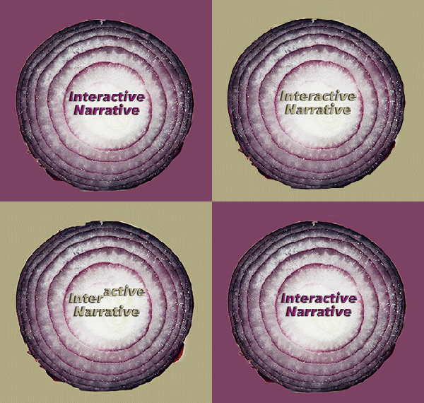
Interactive-OnionBuilding on the definition my partner and I developed in an early class, I define interactive narrative as: A story that uses digital media to engage the audience in a user-centric experience that motivates them to follow a linear or non-linear path, which ultimately achieves stakeholders’ goals.

What I’ve since discovered is how interactive narrative adds multiple dimension to traditional storytelling. Like most stories, it has place, characters and plot but there are various layers within each.

Place can entail the user’s mindset, physical surroundings or device through which they’re experiencing it. (I was also fascinated to learn about Microsoft’s research into four cross-screen engagement pathways, which slice the place layer yet again.)

The hero or central character is always the user and may be alone or one of many. Stakeholders and partners also play pivotal roles, often as masterminds behind the experience.

And the plot is rendered through: varied levels of interactivity, prompts for open or closed input, metaphors, emotions and communication that imparts knowledge and elicits change. I never thought that each story or experience we encounter creates change and some form of new knowledge. I also have a new respect for latent knowledge and the long-term value it provides. I think it’s interesting how an interactive experience can ‘wake-up’ this latent knowledge and connect it to conscious thought.

Through various in-class exercises and assignments, I also gained a greater “hands-on” understanding of interactive narrative and how it can effectively integrate with technical solutions, websites and apps. Many of them made me to consider technology in different ways.

For example:

  • Assessing interactive experiences in terms of audience numbers and levels of interactivity showed me the range of options. It also made me recognize even minute levels of interactivity, such as Banksy’s provocative streetscape murals.
  • The final assignment with the three somewhat conflicting variables of: responsiveness versus resolution; optimization versus ubiquity; and customization versus design, forced me to look at tradeoffs to consider and mitigate in each project.
  • Moving projects to another place or for another stakeholder gave me a new approach for brainstorming new ideas both online and offline.

Although I still face ‘writer’s block’ when I begin to sketch out an interactive concept or wireframe, in class exercises, such as developing a user flow, storyboard or user’s journey helped jolt me forward. Developing a user flow for my senior project and then opening it to critique from my team proved beneficial. During this exercise, my team members highlighted the opportunity to integrate a search process differently and skip a step, which I might have otherwise missed, possibly because I’m so close to it.  With this third-party insight, I developed a smoother search option, which plays out well in my prototype.

Most importantly, learning about interactive narrative and its many layers has given me new insight into how we are potentially moving toward a rich era of co-creation, where designs are created by diverse people/teams. And if this optimistic predication proves true, I can’t wait to see how the world improves as we advance toward it.

Mentoring Wrap-up….For Now

I met with D. again on the Saturday before the Monday when our prototypes were due.  At that point, I had  revised flow charts, a site architecture map, mobile screens developed for two scenarios and a few tablet screens.  D carefully reviewed my work and even though he initially said he only had an hour, he found the work interesting and delayed his departure by about 45 minutes.

He liked the work I had done but made a number of recommendations, based on the following principles:

  • Minimizing hero photos (particularly their height)
  • Avoiding tab menus in mobile and opting for ‘hamburger’ menus instead
  • Using contrast on or behind priority images/widgets/text
  • Grouping text buttons together and separate from icon buttons, versus striving for symmetry
  • Grouping related sections together as a best practice in forms

Although it was tempting to save time and proceed with the wireframes I had, I couldn’t do so after D had flagged improvement opportunities.  This meant spending a good portion of Sunday revising the screens and working through the night to deliver the prototype on Monday.

With my prototype completed, I met later in the week with M. and two agency colleagues of hers: a content strategist (S) and a strategist (J). M had kindly set-up the opportunity for me to present my project and hear their feedback.  I introduced my concept with the banner designed for Digifest (as my project is part of the upcoming student exhibit) and then walked them through my prototype.  M. and her colleagues like the targeted focus of my project, its content and the UX features I’d incorporated.  They offered numerous recommendations to strengthen the solution and highlighted a few best practices to sustain.

Specifically, S. advised me to keep in mind the following best practices:

  • Ensure a consistent voice and tone throughout the site, as often this is lost after the initial pages.
  • Keep the site focused and try not to be all things to everyone or provide content for every senior relevant topic
  • Include some sort of rotating content on the home page to keep people interested, engaged and give them a reason to return

The group’s tangible suggestions included:

  • Checking UX principles and approaches airbnb embraces for ideas
  • Adding a field to the caregiver’s profile to address their personal needs
  • Adding the functionality for someone to share via email in addition to social shares
  • Changing the heart icon for ‘follow’ to something different since a heart is commonly associated with ‘Like’
  • Replacing the map icon with something like an MLS map locator – or even Google maps link
  • Adding overall maps to show seniors’ facilities in key regions/cities
  • Replacing the Upvote button with a thumbs up icon

I was pleased by how supportive they were and surprised to hear J. say that with a few tweaks, my concept would be ready to move to the next stage of bringing a developer on board.  I didn’t think I was that close but who am I to challenge mentors with light years of digital experience on me?

The Rocky Road to Prototype Delivery

SrProjectBlogPost4ImageAgainst what often felt like all odds, my team and I finished a prototype of Senior Care Share — a niche social network for caregivers.  To some extent, it’s like a newborn — alive but ‘sleeping’ most of the time and with only the inkling of a fully animated personality.

There were a few challenges along this birth canal.  Some of the anticipated challenges, such as developing a technically viable solution, adhering to privacy and other legislation and building an engaged user community, have yet to come. Instead, the journey was challenged by:

  1. Defining a clear scope and avoiding the temptation to let it creep
  2. Striving to produce a compelling interface—without having every best practice nailed down
  3. Rapidly learning a tool to bring a concept to life and integrating output from another tool

Keeping the Scope in Check

Fortunately, my concept was an easy sell to anyone who was within or close to my target audience. However, with interest comes ideas and there was plenty. What about a live chat? Online seminars? People ranking products? Giving commercial entities a piece of the action?

Research, such as comparative analysis, audience needs’ assessment and optimal card sort, played an invaluable role in weeding out component contenders and uncovering gaps. These insights helped me set a sane scope of three modules: a Q & A forum (versus a live or open chat); a facilities review; and a section for rewarding participation and nurturing the community.

Striving for a Compelling Interface

As I’m still green at UX and a perfectionist, I scour the Internet for best practices on the shape, position and size of every element when faced with a wire frame task. This dilemma leads to ‘writers’ block’ but fortunately I found a UX mentor who encouraged my early ideas and designs, nudging me forward with a few principles at a time.  I also engaged a team member, initially pegged as an editor, to take UX ownership of one module, which eased the load. His work also gave me new ideas to adapt and iterate across the platform.

Rapidly Learning a New Tool: Axure

My initial plan was to complete wire frame in either Axure or Omnigraffle and then transfer to a specific prototyping tool like Invision.  When my mentor suggested completing it all in Axure, I thought I’d found a ‘shortcut.’  I quickly learned how wrong I was.

I signed up for Axure training videos to help learn this tool, while using it for these critical steps.  My colleague stayed with Omnigraffle and it took a few extra steps to merge the two wire frame types into a unified look and feel.  Fortunately, I was able to cut and paste sections over, which I knew were not perfect but looked blended through most eyes. I also cut corners by opting for the simplest interactive technique: linked pages/widgets, which proved effective to my surprise.

Before this experience, I envisioned a prototype as something more robust with more fully formed content and crystal clear transitions…but time ran out. Like a newborn that’s thrust into the world after nine months to be raised by ‘a village,’ there’s a point where a concept needs to take form and evolve with a community’s input.

Without a forced schedule, ‘my baby’ might be have been internally refined forever, possibly with lame limbs and extra appendages. With a prototype in place, I now need to explain less and the feedback I receive is focused, primarily within scope, and helping this baby grow.

Drilling Down on UX Design Details

Screen Shot 2015-04-02 at 10.55.49 PMI met D., my UX mentor, last Saturday afternoon for two hours in a coffee shop near his home. The pre-agreed purpose of the meeting was to introduce him to my senior project and walk him through my preliminary work on it.

He quickly grasped the project’s concept and purpose to enable caregivers to share proven recommendations and resources with each other. I had various documents on aspects of the project but not surprisingly, he was drawn to the visual materials. D. wanted to start with my personas. He said they were well thought out and looked professional. For future scenarios, he recommended breaking each into smaller chunks, which are easier for a UX designer to reference when developing wireframes.

I showed him process flow diagrams for the Q&A module user path and housing review user path. I also showed him the first wireframe for the Q&A screens.

He reviewed the user flow diagrams in detail and made several suggestions, including:

  • Grouping ‘Yes’ options together and separate from ‘No’ options stemming from the same decision point
  • Limiting rating scale options to three to avoid user fatigue
  • Highlighting the most positive outcomes on the chart with a background tone or colour.
  • Exploring design additions to offset the user’s disappointment in negative areas of the path, such as when they don’t find an immediate answer to their question.

For my wireframes, D suggested limiting horizontal buttons on mobile screens to three and to strive for more white space. He recommended Designing Social Interfaces, by Christian Crumlish and Erin Malone, as a great reference for social solutions. This is particularly helpful as early on I searched for UX resources specific to social and came up dry.

My biggest challenge with senior project is time, as I thought we would have more time this semester to focus on development.  D. suggested shaving time by using Axure for the prototype instead of formatting it in a separate tool, as I’d initially planned.  He also recommended proposing varied stages for the solution to manage breadth of scope and avoid scope creep.

I’m now busy implementing D.’s recommendations, which means making some time-consuming structural adjustments to my user flows.

D. has agreed to meet me again but as his best time is weekends, we can’t meet again until April 11. This is two days before my senior project is due for my semester mark. However, as I’m looking at phases, I consider this the deadline for phase one. I can iterate further for phase two, which is when I will show it as part of a digital show’s student exhibit in early May.

I also heard back from M. with a date to meet with her and a content expert just after the semester deadline for senior project. However, I can apply any advice I glean from this meeting to phase two.

Measuring ROI and Success with Analytics

SONY DSCOur 11th Analytics class was about ‘how’ to measure an online strategy’s return on investment (ROI) — which sounds much simpler than it often is.

Some of the many challenges are:

  • Assessing SEO  – It’s hard to estimate the SEO’s ROI because you can’t estimate the full impact of the long tail. A workaround is to multiply the search volume for top key words by 3.3 (or 30% of the possible clicks) but this is just an estimate.
  • Defining Social Media ROI – You can’t always definitively tie a social conversion to a specific financial metric.  Subsequently, you need to assign a financial value for each social engagement metric by testing and validating social activity. For example, if you generate a $1,000 sale for every 10,000 Twitter re-tweets (RT), each RT is worth $10
  • Attribution Analysis Quandary – There is no definitive answer on which brand/campaign touchpoint ‘wins a visitor over’ and prompts them to complete the desired action (e.g. purchase, sign-up or send an email inquiry). It may be the fourth visit to the website or seeing the item in the store after after reading about it once on the website. As an alternative, Sofia outlined a blend of Media Mix Modeling and Marginal Attribution Analysis. Specifically, this means measuring your baseline, allocating part of the budget to one marketing channel, run tests with/without it and track impact until the value declines. Repeat for each channel until you find the most cost-effective combination with the highest returns.
  • Offline Impacts – Offline promotions and external events (e.g. new competition, scandal, market crash) can skew results. You need to take extra steps to track offline promotions, such as setting-up vanity URLs to track coupons, and find rationale for traffic patterns.
  • App ROI – Apps aren’t cheap to make or run. To measure their ROI, you need to consider the Total Cost of Ownership (TCO), including development and ongoing operation costs, which can fluctuate over time.

So while measurement is a finite science, measuring online ROI is part art because it requires some subjective decisions.

Sofia provided comprehensive best practices and a number of formulas, which I think will give me long-term value — or ROI on the cost of her college course. However each campaign and scenario is different and there is no ‘cookie cutter’ solution.

What does this mean to me?

For example, the business model for my senior project generates revenue by selling online advertising. If I need 10,000 page views per month to sell a $1,000 ad but I currently only get 9,000 views per month, I might use a keyword upgrade to drive traffic to my site. The resulting formulas might look like:

For SEO Revenue:

18,000 (people searching for my keywords) X 10% (average success rate, where I define success as clickthroughs with page views) = 1,800 new page views

$1,000/1,800 = $0.50 value per page view

For ROI:

$1,000 (July SEO Ad Revenue)/$200 (Contractor to identify keywords and incorporate them into site) = ROI of 5

Illustration Source: Lisa Solonynko /Haml via Morgue File.